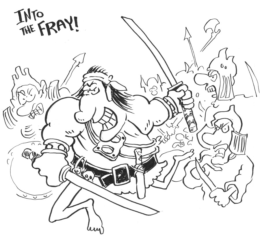
I love how old comics look. This is a panel from Groo the Wanderer no. 1 (Pacific Comics, not Epic). The coloring is very simple, but kind of elegant. Notice the subtle variations in the textures and tones.
And, of course, none of that is "real". Meaning, the colorist didn't achieve those textures, for example. The colorist, Gordon Kent, was probably using Dr. Ph. Martin's liquid dyes, which was extremely common for colorists of that day. They would lay down some dyes so they could have a fairly exact concept of the actual hue and saturation to tell the printer, who would then try to approximate that hue and saturation with the printing press on cheap paper using little dots.
The printing was fast and cheap on cheap paper and it would be imperfect. Little variations in the coverage would create some variations in the texture. Over time, the pages would fade, exaggerating some of that.
The nostalgic look and feel of this kind of comic panel is purely an artifact of the way it was produced after the artists did their thing. That's why, when comics started to shift to digital tools and better paper and better printing, those colors suddenly POPPED and were actually pretty garish. The imperfections of the older methods and cheaper paper helped tone down the vivid dyes, giving us that soft, slightly yellowed comic book look we know and love.
You can attempt to mimic it, digitally. There are entire brush packs and other digital tools you can buy that specifically give you a similar look to your finished digital art. I don't prefer to use those, myself. You can also sort of "kitbash" the colors by scanning your stacks of old, beat up comic books and using the textures and tones from them as source to color your artwork. I've done that before and the effect is kind of fun.
Anyway, the point I wanted to make is mainly that this old, nostalgic comic book look is not really due to the craft of the colorist as much as the state of the printing processes of the time. Hard to duplicate today, but not impossible. Part of me wonders why anyone would want to do that, but a bigger part of me totally gets why you would want to do that. It's an aesthetic, accidental or not. Many of us grew up on this aesthetic and it holds just as powerful and dear a place in our heart as any other artistic aesthetic, such as loving the way an artist's brush strokes can still be seen in some paintings or how a record can have those intermittent popping sounds from the needle meeting the grooves.

Here's an example of a panel from an issue that came out more than a decade after the first comic. You don't see all those little dots. The printing methods and paper choice has changed by the 90s. I don't know the ins and outs of the process with pros of the time, so I can't speak to it. But I have to assume the colorist needed to be more cautious in their color choices since what they got in print was going to be a lot closer to what they put on the paper. No more exaggerating to help the printer. I think.


.jpg)