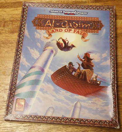
But consider it for a moment. There is a lot of dead space here. Lots of blue sky, the bottom of a rug, and just the tippy tops of some towers.
This is the cover art for your premiere box set for an RPG adventure game setting. Don't you want to emphasize the danger, the excitement, the heroes, the villains, and/or the splendor of the setting? This cover does not really do any of that, does it?
The figures are quite small. The leaping assassin (cleverly putting the sun to their back) doesn't necessarily pop out. The two heroes on the rug are not very big in the frame and are somewhat obscured by the bottom of the rug... which is dominating the middle of the picture.
This is a setting billed as "fabulous". Why are we only getting the tippy tops of some towers? Why not show us the grand cityscape of what is most likely supposed to be Huzuz, the City of Delights? Why is this framed like a person snapping pics on vacation and picking the worst shot?
I do not know. I wonder if the cover art was rushed due to deadlines? Or was it just a well-intentioned attempt that kind of fell a little flat? (There's a LOT of blue sky there... and we can see blue skies in the real world.)
The figures and other elements of this painting are well-done. It doesn't look like the artist skimped on getting his figures and anatomy right. Nothing looks awkward. It's just that the composition and choice of framing is very strange to me.
Or is it just me? Am I being hyper critical for no good reason? (Don't answer that question.)
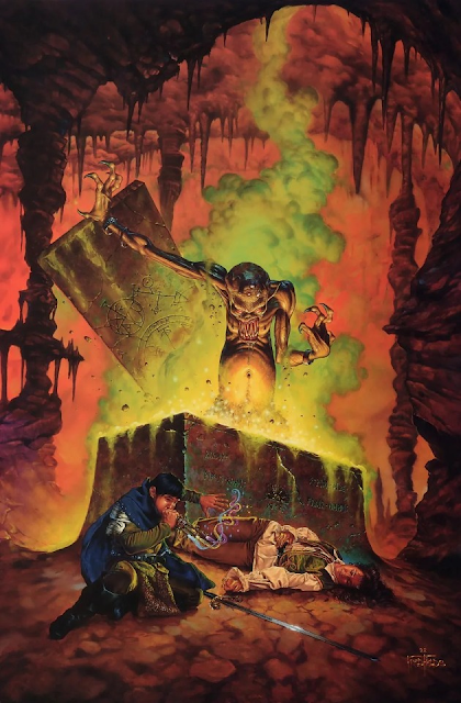
For comparison, check out another Fred Fields piece. The guy can paint and can nail an exciting composition.


