Some recent sketchbook doodles for fun and no profit.
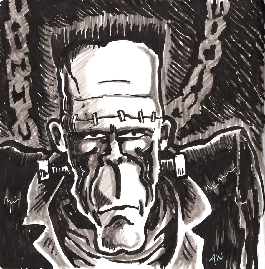 |
| Frank's Boy - Sailor brush pen, Pitt gray markers |
 |
| Shellhead - Tombow brush pen, alcohol markers |
 |
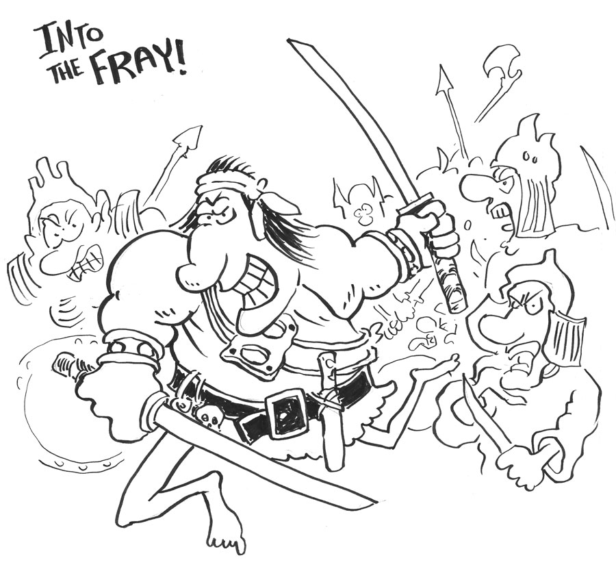
| Cimmerian - brush pens, felt pens |

Some recent sketchbook doodles for fun and no profit.
|
| Frank's Boy - Sailor brush pen, Pitt gray markers |
|
| Shellhead - Tombow brush pen, alcohol markers |
|
| Cimmerian - brush pens, felt pens |
The print proof of Hellion Cross looks really nice! I love the fact that you can do this shit in 2024 without a ton of monetary investment. Of course, I'll have to pay for the actual copies I plan to put up for sale. Final sale price will likely be $15 each. I wanted to sell them for less, but the cost of mailing and packaging AND the cost of printing the books... it adds up.
I'll post about it when the books become available. My plan is to sign each and include a sketch card. Collector's item!


Unless I'm dead or something, today I'm on my way to see King Gizzard and the Lizard Wizard live! Very exciting! Great band. If I had a current favorite, they would be it.
I'll see you after the show.

The adventure into artists continues with a creator I don't remember hearing about until recently, but I almost certainly saw his work at some point in the past: François Walthéry.
This Belgian artist got started in the comic magazine Spirou, which I am unfamiliar with. His biggest claim to fame is being the primary artist for the comic character Natacha, a "resourceful airline hostess". Welz has Cherry, Thorne has Red Sonja, Walthéry has Natacha.
And here's the surprising bit... I didn't decide to post about this artist because Natacha is a hot femme cartoon character. No no. While it is true, it is also true that François Walthéry is an exceptional cartoonist and I hope to pick up some of his books just to study them! Good stuff.
And it seems Natacha is very, very popular. Lots of material out there, including a postage stamp?!


Will you exaggerate the fuck out it the way R. Crumb or Vaughn Bodé did? Or will you reel it in a bit and go a bit more Harvey Kurtzman or Mort Drucker?
To be totally honest, I haven't given it a lot of thought. I've been drawing comics and art since I was a kid and I have barely thought about how characters walk. It only ever comes up when - SHOCKER - I have to draw someone walking. Here's a few examples of how I've done it in the past. Keep in mind: no thought. Just do. Is it good? Do I need to step up my game?


And, of course, none of that is "real". Meaning, the colorist didn't achieve those textures, for example. The colorist, Gordon Kent, was probably using Dr. Ph. Martin's liquid dyes, which was extremely common for colorists of that day. They would lay down some dyes so they could have a fairly exact concept of the actual hue and saturation to tell the printer, who would then try to approximate that hue and saturation with the printing press on cheap paper using little dots.
The printing was fast and cheap on cheap paper and it would be imperfect. Little variations in the coverage would create some variations in the texture. Over time, the pages would fade, exaggerating some of that.
The nostalgic look and feel of this kind of comic panel is purely an artifact of the way it was produced after the artists did their thing. That's why, when comics started to shift to digital tools and better paper and better printing, those colors suddenly POPPED and were actually pretty garish. The imperfections of the older methods and cheaper paper helped tone down the vivid dyes, giving us that soft, slightly yellowed comic book look we know and love.
You can attempt to mimic it, digitally. There are entire brush packs and other digital tools you can buy that specifically give you a similar look to your finished digital art. I don't prefer to use those, myself. You can also sort of "kitbash" the colors by scanning your stacks of old, beat up comic books and using the textures and tones from them as source to color your artwork. I've done that before and the effect is kind of fun.
Anyway, the point I wanted to make is mainly that this old, nostalgic comic book look is not really due to the craft of the colorist as much as the state of the printing processes of the time. Hard to duplicate today, but not impossible. Part of me wonders why anyone would want to do that, but a bigger part of me totally gets why you would want to do that. It's an aesthetic, accidental or not. Many of us grew up on this aesthetic and it holds just as powerful and dear a place in our heart as any other artistic aesthetic, such as loving the way an artist's brush strokes can still be seen in some paintings or how a record can have those intermittent popping sounds from the needle meeting the grooves.

Here's an example of a panel from an issue that came out more than a decade after the first comic. You don't see all those little dots. The printing methods and paper choice has changed by the 90s. I don't know the ins and outs of the process with pros of the time, so I can't speak to it. But I have to assume the colorist needed to be more cautious in their color choices since what they got in print was going to be a lot closer to what they put on the paper. No more exaggerating to help the printer. I think.


This Sunday's artist is a mysterious Instagram figure known as Stardriver Art. I'm pretty sure this is a female artist, but I apologize if that's incorrect. I couldn't find a website outside of the Insta account.
So... Stardriver does epic 80s style, airbrush type fantasy art that would be more than comfortable on the side of your van any day of the week... and I love it. She seems to have a great love of 80s metal and metal in general, which I also love. The art is quirky and almost naive (as in self-taught, not meant to be a dis). I don't know if that's the case or not, but it has that vibe. To me, that's one of her great charms.
Seeing her art makes me want to buy a van and paint it. That's all I'm gonna say.


.jpg)
.jpg)
.jpg)
.jpg)
.jpg)


One of them is Pan-Gea, which encompasses all of my work on Black Pudding and the new comic Hellion Cross as well as the Troika!-based RPG books I've done. It is all one grand setting, just spanning a lot of time. The connective tissue between them all is a pantheon of gods, demigods, and immortal beings such as Nest the Moon, Seer the Sun, and the Worm Witch.
Contrasting this is another world I call Yukkara. This world is about funny animals. Why is it distinct? Because in my lizard brain I NEED and WANT a world that is entirely comprised of talking cartoon animals (along with demons, dragons, wizards, etc.). No humans, you see.
The world of Yukkara is largely "governed" by six powerful gods pictured here in this sketchbook drawing. Each of these deities have "clever" names that are word plays which I will unpack for your pleasure and entertainment. If I'm not terribly mistaken, this is the first time I've posted about these guys. I know I conceived them years ago because I have multiple documents and journal entries that mention them going back in time at least a decade.
• Owldina is the Goddess of Knowledge and Wisdom. She is represented by an owl. I don't remember Owldina's name referencing anything other than she's an owl. Which is funny because she's a knowledge goddess... get it? There's no extra knowledge to uncover on that one. Hah.
• Jehawkva is the God of the Skies. He is a hawk or some other raptor. Jehawkva is a play on both hawk and jehovah. Clever bastard.
• Marduck is the God of War. He is a duck. Marduck is just a play on Marduk, who isn't specifically a war god. But it also sounds like Warduke, and he's a war guy.
• Buddacuda is the Deity of Truth and Mindful Doing. He is a fish. Buddacuda... seems obvious to me.
• Porkus is the God of Death. He is a pig. Porkus is Orcus but a pig. It's been done before, but that's fine. Something as obvious as Porkus is gonna get done over and over. Same with Marduck. It's fine.
• Eweweh is the Goddess of the Earth. She is a sheep. Eweweh is a combo of ewe and yaweh. Clever bastard. I even threw in a little bit of lore, as the kids say, that Eweweh is often characterized as a male god, which pisses her the fuck right off. Which is a nod to the fact that Yaweh is a masculine god figure. The layers of my cleverness are rich and myriad.