Sunday, September 1, 2024

Nobody Nose

I'm a sucker for a good pun, I guess.

This is a post about drawing noses. Because it is not an easy thing to do. And yet, also, quite easy. I dunno how to say that in a way that sounds smart. Let's just look at some examples of artists drawing noses, then look at how I draw them. Because I'm gonna predict that I do not have a consistent way of doing it. Which... is fine, I think. Art is feels, not accuracy.

Most artists tend to draw female noses differently than male ones. I guess because they want to ladies to have "pretty" noses, so they reign in their wilder cartooning habits for something more modest.

Here's a bit of Sergio Aragonés. I thought this was a nice little capsule of noses. See how each character has a completely different looking nose? Aragonés is a master of cartooning and he really tries to give each character a look of their own. Notice how Groo's granny here has a nose just like Groo's.


But when Aragonés wants to draw the pretty girls, he switches gears too.

Abe Snake, artist of the adult comic Muffin Topp, draws very cute little noses on his ladies too, often just a curved line pointing up.

But here are some male characters from Muffin Topp.

Comic artist Rune Ryberg opts for a little curved line pointing down on many of his females.


Here's a scene from a Ryberg comic showing men and women together. The female noses are slightly smaller, on average, but the size difference here is not very noticeable.


Vaughn Bodé liked to suggest a female nose, often in different ways. There are far fewer examples of his male noses on human characters because so many of his characters are lizards, robots, and weirdos.

And here are a few other artists working in styles that I like.


The classic pinup style female nose is small, usually upturned, and just not very prominent. It is there, but not dominant.

Yet many women have big honkers. What about cartoonists who draw more prominent noses on their women as well as their men? Now, I think in the above example you can see that William Skaar's treatment of noses on his female characters is kinda cool and interesting. He doesn't give them tiny, upturned noses. Their honkers are more pronounced. I like that. It's a different vibe.


An assortment of cartoonists leads to an assortment of noses.


Noses can be almost any shape. No wait, fuck that. Noses can be any shape. Whatever you want to draw. If you want to draw a ridiculous little square for every nose on every character, you can do that. Because this is art. There are no rules.

Yet we don't just draw squares for noses, usually. We want to express something. And it won't always be satisfied with a little square. We experiment, doodle, and screw around with it until we draw a nose we think looks about right. Then maybe we draw a lot of noses like that as we move forward into our journey.

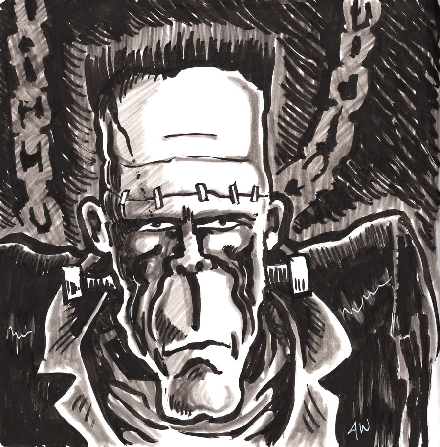
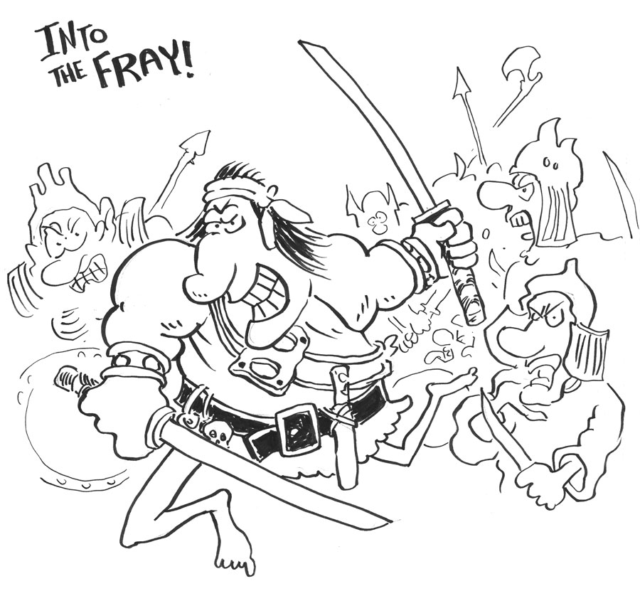
Here are some noses from my own art. I don't have a standard style for noses. I go with what feels right. My noses have changed over the years, though. I used to try to draw them realistically when I was young, then I shifted to something more cartoony. I'm still searching for noses.


Artists I Like: Wendy Pini

This week's Artist I Like is the legendary Wendy Pini, co-creator of the classic Elfquest series of comics and stuff. Her long-time husband and partner Richard Pini co-created the comic with her and was a co-writer, editor, etc.

Wendy Pini has a style and approach to art that, I think, has inspired many generations of artists. If you've ever seen a faerie or elf drawing and said it reminds you of Keebler Elves, for example, that artist was probably inspired by Wendy Pini or by some artist who was inspired by Wendy Pini. There were a LOT of artists in the 80s inspired by Pini's work, especially among the small press and alternative comics folks. Just look at anything from Aircel or later from Sirius to see the connection. Heck, even a recent inclusion on my Sunday list, Stardriver Art, has a style that contains some Pini DNA.

Personally, I never owned any Elfquest comics when I was younger. I picked up the hardback volume one of the series in the early 2000s and I think I own a softcover volume two. She is an artist I have admired from afar, but never dived into very deeply. Maybe there wasn't enough carnage and nudity for my tastes... I think Elfquest is a fairly tame comic. My perception of it is that they always wanted to turn it into an animated series or movie, and have been conscientious about their content choices for that and other reasons. But I could be wrong about that.

Oh, Wendy Pini was also famous for doing cosplay. Specifically, she is very well known for her seminal Red Sonja cosplay, riffing on Frank Thorne's classic run.

Also, for the record, I just this minute realized that "WaRP" as in Warp Graphics stands for Wendy and Richard Pini. Wow. 

EDIT: Here's a great video about the Pinis and Elfquest. It hits on the history and reminds us how much the Pinis influenced the creator-owned comic book movement. Very nice.

EDIT TOO: Thanks to the video above, I learned that the Pinis donated all that original Elfquest art to The Rare Book and Manuscript Library at Columbia University... isn't that beautiful? You could, in theory, go there and sit and look at it. Amazing.


Saturday, August 31, 2024

Sketchbook 08-31-24

Some recent sketchbook doodles for fun and no profit. 

Frank's Boy - Sailor brush pen, Pitt gray markers

Shellhead - Tombow brush pen, alcohol markers

Cimmerian - brush pens, felt pens


Tuesday, August 27, 2024

Monday, August 26, 2024

Hellion Cross Print Proof

The print proof of Hellion Cross looks really nice! I love the fact that you can do this shit in 2024 without a ton of monetary investment. Of course, I'll have to pay for the actual copies I plan to put up for sale. Final sale price will likely be $15 each. I wanted to sell them for less, but the cost of mailing and packaging AND the cost of printing the books... it adds up.

I'll post about it when the books become available. My plan is to sign each and include a sketch card. Collector's item!


Groo Fanart

Here's a bit of Groo fan art, for fun and giggles!


Sunday, August 25, 2024

KGLW

Unless I'm dead or something, today I'm on my way to see King Gizzard and the Lizard Wizard live! Very exciting! Great band. If I had a current favorite, they would be it.

I'll see you after the show.


Artists I Like: François Walthéry

The adventure into artists continues with a creator I don't remember hearing about until recently, but I almost certainly saw his work at some point in the past: François Walthéry.

This Belgian artist got started in the comic magazine Spirou, which I am unfamiliar with. His biggest claim to fame is being the primary artist for the comic character Natacha, a "resourceful airline hostess". Welz has Cherry, Thorne has Red Sonja, Walthéry has Natacha.

And here's the surprising bit... I didn't decide to post about this artist because Natacha is a hot femme cartoon character. No no. While it is true, it is also true that François Walthéry is an exceptional cartoonist and I hope to pick up some of his books just to study them! Good stuff.

And it seems Natacha is very, very popular. Lots of material out there, including a postage stamp?!


Sunday, August 18, 2024

Cartooning the Walk


Hey, you know what's important for characters in a comic book story? Moving around. One of the most common ways that characters move around is to walk. It's a comic, so you have to show that walk, at least to some degree. It's not animation, so you don't need to map the entire walk, but you gotta have some kind of walking motion. How you gonna draw it?

Will you exaggerate the fuck out it the way R. Crumb or Vaughn Bodé did? Or will you reel it in a bit and go a bit more Harvey Kurtzman or Mort Drucker?

To be totally honest, I haven't given it a lot of thought. I've been drawing comics and art since I was a kid and I have barely thought about how characters walk. It only ever comes up when - SHOCKER - I have to draw someone walking. Here's a few examples of how I've done it in the past. Keep in mind: no thought. Just do. Is it good? Do I need to step up my game?


The Aesthetic of Old Comic Colors


I love how old comics look. This is a panel from Groo the Wanderer no. 1 (Pacific Comics, not Epic). The coloring is very simple, but kind of elegant. Notice the subtle variations in the textures and tones.

And, of course, none of that is "real". Meaning, the colorist didn't achieve those textures, for example. The colorist, Gordon Kent, was probably using Dr. Ph. Martin's liquid dyes, which was extremely common for colorists of that day. They would lay down some dyes so they could have a fairly exact concept of the actual hue and saturation to tell the printer, who would then try to approximate that hue and saturation with the printing press on cheap paper using little dots.

The printing was fast and cheap on cheap paper and it would be imperfect. Little variations in the coverage would create some variations in the texture. Over time, the pages would fade, exaggerating some of that.

The nostalgic look and feel of this kind of comic panel is purely an artifact of the way it was produced after the artists did their thing. That's why, when comics started to shift to digital tools and better paper and better printing, those colors suddenly POPPED and were actually pretty garish. The imperfections of the older methods and cheaper paper helped tone down the vivid dyes, giving us that soft, slightly yellowed comic book look we know and love.

You can attempt to mimic it, digitally. There are entire brush packs and other digital tools you can buy that specifically give you a similar look to your finished digital art. I don't prefer to use those, myself. You can also sort of "kitbash" the colors by scanning your stacks of old, beat up comic books and using the textures and tones from them as source to color your artwork. I've done that before and the effect is kind of fun.

Anyway, the point I wanted to make is mainly that this old, nostalgic comic book look is not really due to the craft of the colorist as much as the state of the printing processes of the time. Hard to duplicate today, but not impossible. Part of me wonders why anyone would want to do that, but a bigger part of me totally gets why you would want to do that. It's an aesthetic, accidental or not. Many of us grew up on this aesthetic and it holds just as powerful and dear a place in our heart as any other artistic aesthetic, such as loving the way an artist's brush strokes can still be seen in some paintings or how a record can have those intermittent popping sounds from the needle meeting the grooves.


Here's an example of a panel from an issue that came out more than a decade after the first comic. You don't see all those little dots. The printing methods and paper choice has changed by the 90s. I don't know the ins and outs of the process with pros of the time, so I can't speak to it. But I have to assume the colorist needed to be more cautious in their color choices since what they got in print was going to be a lot closer to what they put on the paper. No more exaggerating to help the printer. I think.